GownCard

Mobile App Design

GownCard

As part of Wond’ry, Vanderbilt’s Innovation Center, I worked with surgeons and nurses at Vanderbilt University Medical Center to redesign GownCard—an mobile app that supports surgery scheduling and medical supply tracking. The original version slowed down workflows and contributed to annual waste of unused surgical tools.

I structured the app with a focus on pre-operative tool preparation and real-time case updates. I conducted 12 interviews and 25+ beta tests, gathering critical user insights to iterate designs. The redesign led to a 30% boost in workflow efficiency, a 35% reduction in supply waste, and $220K+ in annual savings, while increasing user satisfaction by 60%.


Role

UX Designer

Collaborated with PM, researchers, data specialists, content strategies, designers.

TimeLine

Sep – Dec 2024

Three months

Tasks

Low-fi and High-fi prototyping

User Research

Usability Testing

Tools

Figma

Google Forms

First

What’s the Problem?

Vanderbilt University Hospitals face major inefficiencies and waste in the operating room due to complex surgeries, varied surgeon preferences, and workforce shortages. These issues lead to unnecessary costs, wasted tools, and risks to patient safety.

Although GownCard was designed to streamline surgical preparation, its current version fails to provide a unified solution. Inefficient provisioning and unprepared teams continue to cause billions in waste each year. Our goal is to identify user pain points and redesign GownCard into a more effective, user-friendly tool for surgical teams.

Second

Conduct User Interviews

To uncover user pain points, I conducted interviews with both surgeons and nurses via Zoom and documented their feedback in detail:

  • What they liked

  • What frustrated them

  • 🔮 What they wished for

In addition, I visited the hospital in person.

By wearing a white coat and shadowing their workflow, I immersed myself in their fast-paced environment to better understand their needs and challenges.

“We need a centralized system where nurses can log and update supply data in one place, so we’re prepared without relying on trial and error.”

Lesleigh Meece, CSL Perioperative Services @ Children’s Hospital at Vanderbilt

“Preference cards are often inaccurate, creating confusion for nurses. Being able to update them in real time ensures each case has exactly what’s needed.”

Shelby Porter, Clinical Staff Leader @ Vanderbilt Univeristy Medical Center

Summarize

Problem

1. Who is the surgeon?

Nurses often don’t know which doctor is assigned to a surgery, making it difficult to ask questions or clarify details before the operation.

2. What tool to prepare?

Since surgeons don’t consistently use the app to update tool requirements, nurses are left without the details they need.

3. When to record tools?

In the fast-paced surgical environment, surgeons have little time to record tool usage before moving on to the next patient, making it challenging to keep accurate records.

Design Goals

Balancing Fast-Paced Workflow with Surgical Accuracy

From interviews and on-site hospital visits, I uncovered a core conflict:

The hospital’s rapid pace often clashes with the need for precise, error-free surgical tool preparation.

⚠️ This raises a key challenge:

  • ➤ How might we balance speed with accuracy?
  • ➤ How might we support both efficiency and safety in the OR?

Fast VS. Accurate

Old Version

Information is not organized; sections appear in a random order.

Text, images, and notes are mixed together, making it hard to scan.

Tiny buttons and crowded UI increase the chance of mistakes.

let’s make a change.

Third

The Solution

I want to solve the problems one by one:

For the three main pain points identified in the interviews, I aim to completely solve the conflict between Speed V.S Accuracy.

💡 My solution focuses on:

  • Improving existing features to make the interface smoother and more intuitive
  • Adding new features to directly address the core pain points
  • Enhancing the UI to create safer, more efficient workflows

Don’t know which surgeon to contact?

Adding a shared calendar for clarity.

Don’t know which tool to prepare?

Preference cards bring accuracy.

Too busy to keep records?

Adding a shopping cart to track items.

It’s Figma Time

Making Ideas Happen 💡

Function 1 – Calendar

A daily calendar displays upcoming surgeries with key details.
Nurses can quickly reach the right surgeon, saving time and ensuring tools are ready.

The problem of not knowing who to contact or how to reach them is solved.

Function 2 – Preference Card

Preference cards show tool categories, quantities, and status before, during, after surgery.

They help nurses quickly identify required tools, check stock, and receive notifications —

improving visibility, accuracy, efficiency, and reducing waste.

Function 3 – Shopping Cart 

The shopping cart lets nurses search for tools and review past selections.
It helps them quickly find specific instruments, reuse prior setups, and save time —

streamlining preparation and improving efficiency

UI matters as much as UX.

Fourth

Visual Design

Primary Color — Soothing Aqua (#B4E8EC)

  • Role: Primary UI color, used for key actions, highlights, and navigation.
  • Tone: Calm, clean, and trustworthy.
  • Rationale: Positioned between white and bright cyan #00F6FF, this aqua evokes clarity and a sense of safety.

Secondary Color — Warm Blush (#FCBFBF)

  • Role: Supporting accent, used for alerts, secondary buttons, or subtle highlights.
  • Tone: Friendly, human-centered, and approachable.
  • Rationale: A soft red that avoids the stress of pure red #F80000, introducing warmth and emotional balance into the interface.

Why Bubbles + gradients?

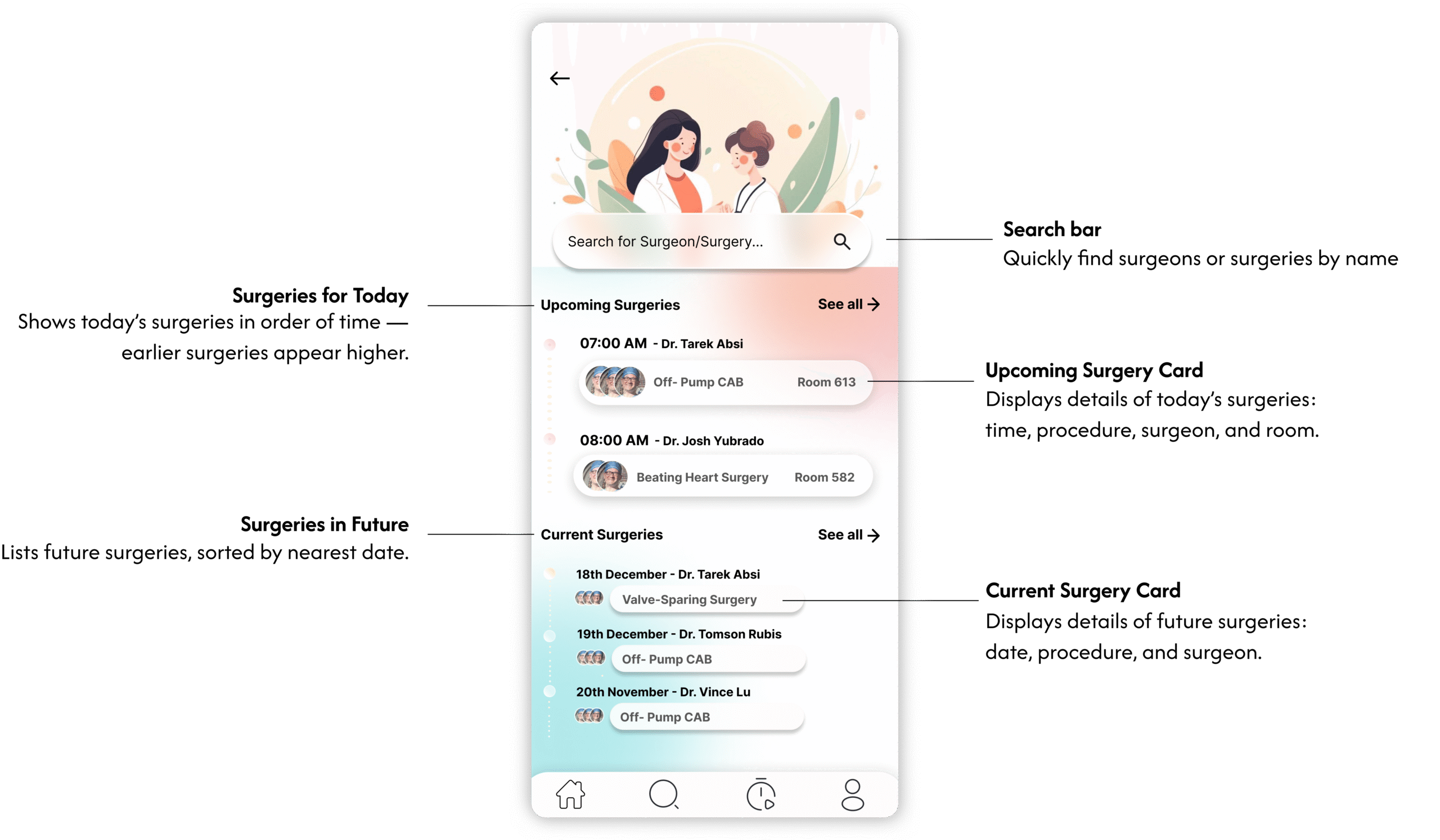
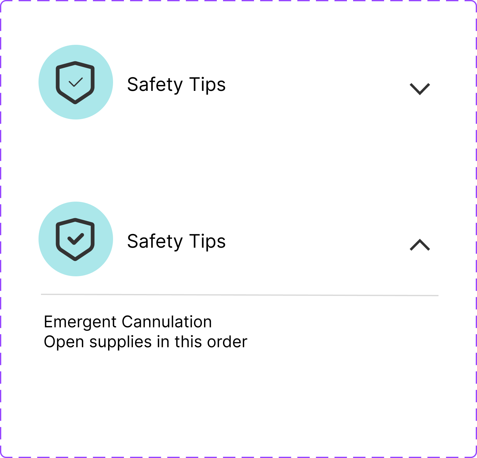
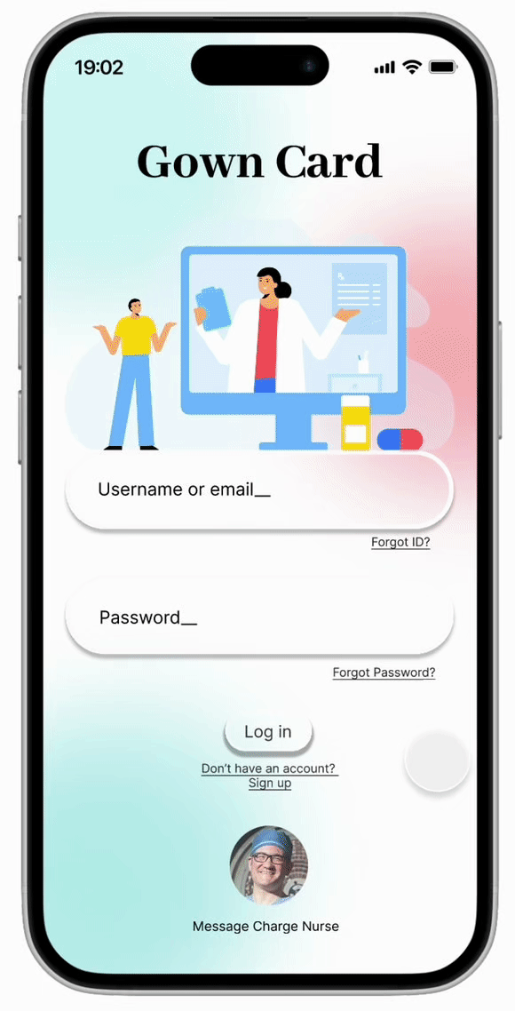
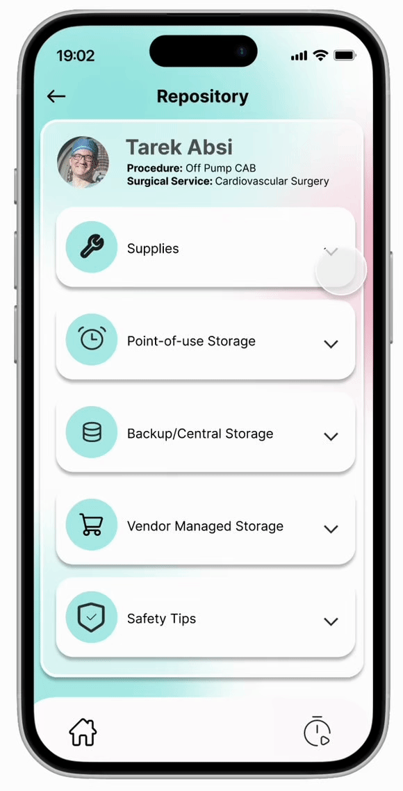
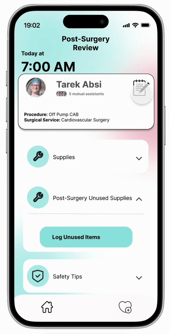
Bubbles and gradients were chosen to bring calm into a high-pressure hospital space.

Research suggests that humans instinctively prefer curved shapes over sharp edges, as curves evoke softness, safety, and ease (Blazhenkova et al., 2020). Bubbles, in particular, foster mindfulness and relaxation by encouraging steady breathing and gentle visual focus. Similarly, soft gradient borders—especially in cool tones—enhance emotional depth and evoke a tranquil, dream-like atmosphere (Kovack, 2019). Combined, these visual elements help reduce stress, provide comfort—an especially valuable benefit for surgical staff working in high-pressure environments.

Where Function
Meets Flow.

We made it!

User-friendly. Efficient. Reliable.

Fifth

Result

30% Efficiency 📈

35% Waste 📉

99.8% Satisfaction 😊

$220k Saving 💰

Reflection

Key Learnings

1.

Experience Beats Assumptions.

Don’t guess stakeholder problems—observe, experience, and validate in the field.

2.

Consistency Matters—But Context Matters More.

Beautiful backgrounds are great,
but function leads form;user-friendly ≠ merely pretty.

3.

Think First, Then Design.

Clarify the problem logic before pixels:
analyze and structure,
distill the core, then design in Figma.

Thanks!

@Wond'ry Fall 2024