As the UX Designer at Voderrn, a second-hand fashion startup empowering users to build personalized wardrobes and exchange pre-loved clothing, I led the end-to-end design of the website—focusing on the landing, settings, and profile pages to create an intuitive, user-centered experience.
2,000+
Global Users Reached
1,500+
Transactions Completed
$50K
Profit Generated
45%
Satisfaction Increased
Role
UX Designer
TimeLine
May 2025 – Present
Tasks
Low-, mid-, and high-fi prototyping
Competitive brand analysis
User pain points
Usability testing
Build from 0 to 1
Tools
Figma
Google Form
Team
1 PM
3 Designers
3 Developers
2 Marketers
First
What’s the Problem?
On average, people own148 pieces of clothing,
yet still feel they have “nothing to wear.” Our goal is to turn this problem into personalized outfit choices that boost brand visibility and sales.
🎯
The key challenge:
How can a new brand stand out, convey purpose, and
redefine sustainable fashion from the ground up?
Let’s Dive Deeper
Target User
Women aged 20–45
20+ research papers show that
US Fashion E-Commerce
(Capital One Shopping, 2025)
58.2%of mobile apparel shoppers are women
68.5%online apparel revenue is women’s clothing
Resale Platforms
(ThredUp Resale Report)
~1/3of U.S. women bought used apparel in the past year
~2×the rate of men
Age Matters
(Statista, 2025)
29.7%25–34 of resale shoppers
23.8%35–44 of resale shoppers
Data Visualization
Know Competitors
I reviewed 10 leading fashion platforms to compare their strengths and weaknesses.
Gender Distribution Across Competitor Platforms
We Find
1 Thing is Missing in All—
Personalized Wardrobe Experience
Users often struggle to find fashion matching their aesthetic
User Interview Quotes — With Avatars
"School keeps me so busy. If I could just shop my style, it really
saves me a lot of time."
— Amy, 20, college student
"My shopping process is usually pretty chaotic. A personalized filter would really
stop me from buying pieces that don't actually suit me."
— Sophie, 25, new grad
"With clear style tags, it's so much easier to find buyers who actually like the style I'm selling.
It saves me time and helps me increase sales."
— Yu, 40, fashion seller
Findings
Key Pain Points
1. No Personalized Matching
No style guidance makes it hard for users to find clothes that fit their style.
2. Too Many Steps
A long flow create friction and increase drop-offs before purchase.
3. Unclear User Group
Trying to serve everyone misses users who are most likely to purchase.
Let's Solve Them
StepbyStep
First Challenge
How might we
personalize wardrobe?
“If I tag specific aesthetics rather than just brands or colors I get a lot more traffic and sales.”
— Reddit
Instead of relying only on traditional categories, we introduce
10 aesthetic styles.
Users can filter by the specific aesthetics they’re drawn to, making the shopping experience
more targeted and personalized.
Let’s build aWardrobe!
“Need a new dress—how can I find the right one fast?”
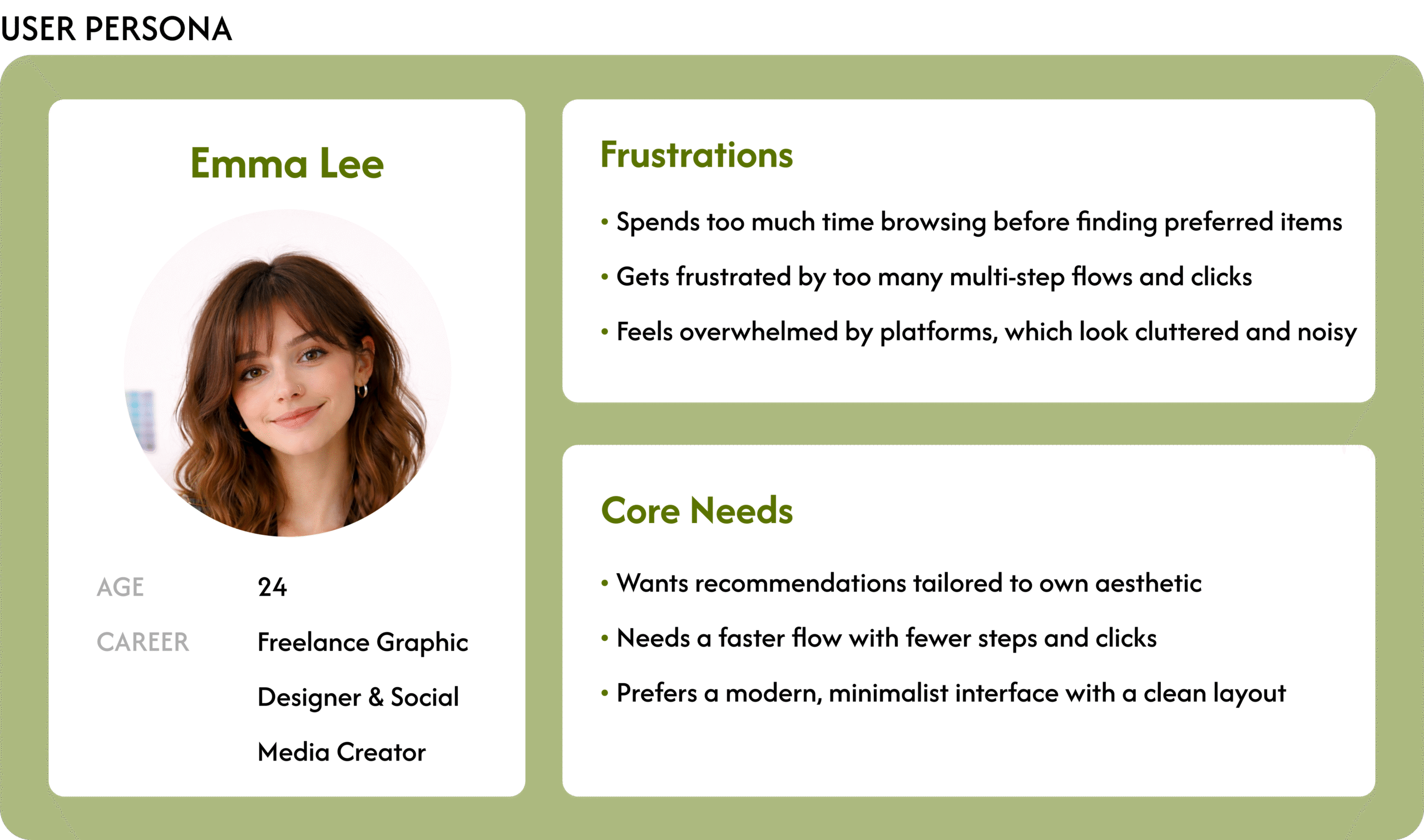
One day, Emma is looking for a business-casual dress set for her daily commute.
As a new grad on a tight budget, she decides to shop secondhand.
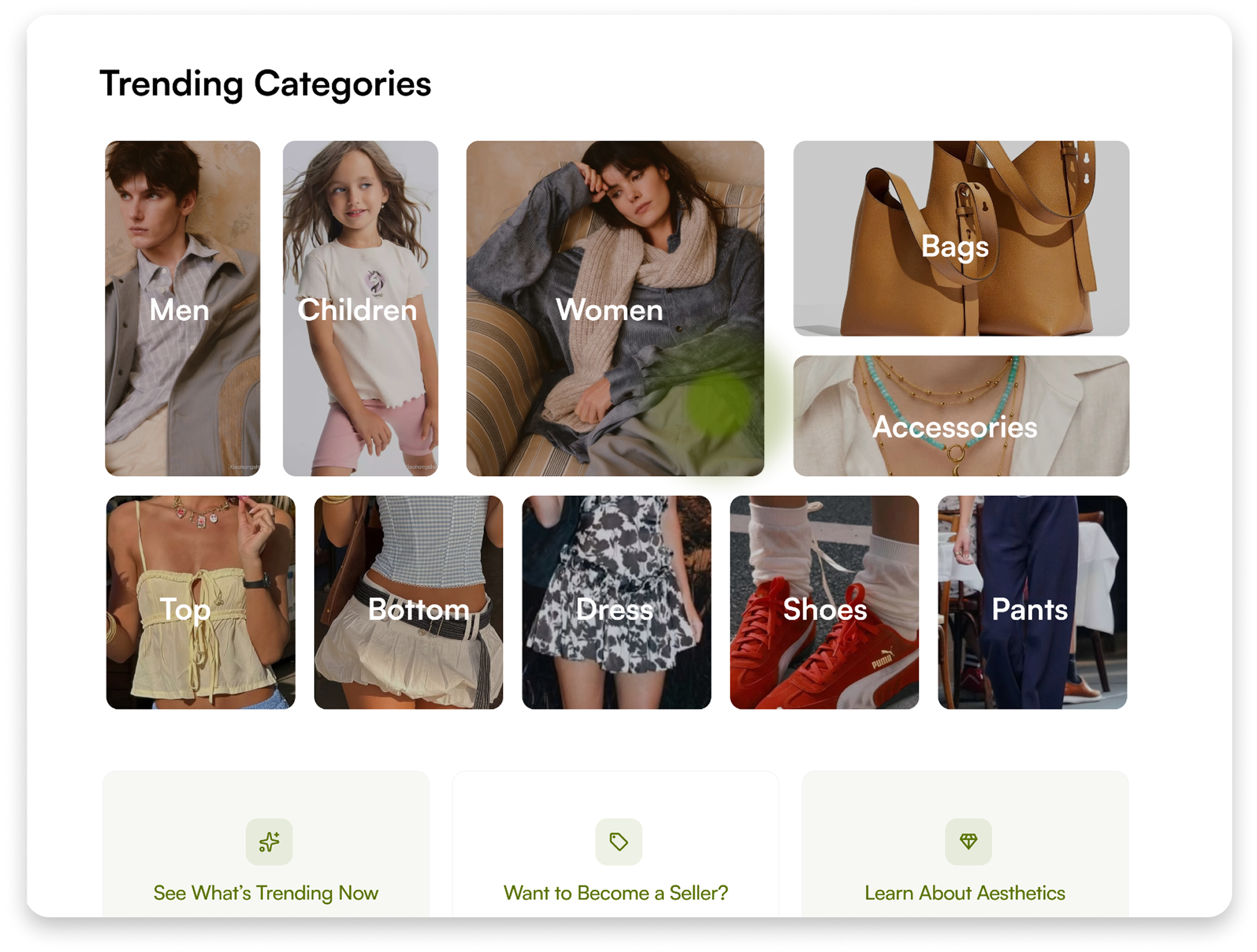
She Googles for options, discovers Voderrn, and lands on the homepage
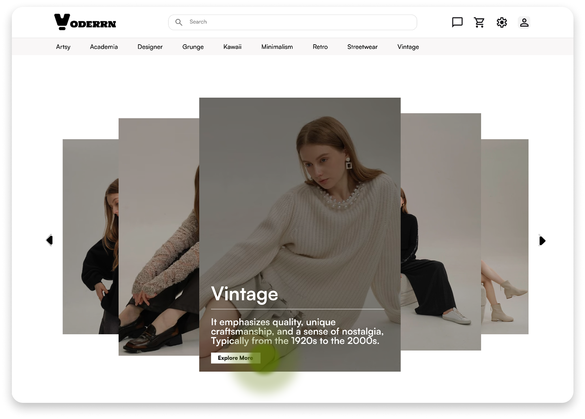
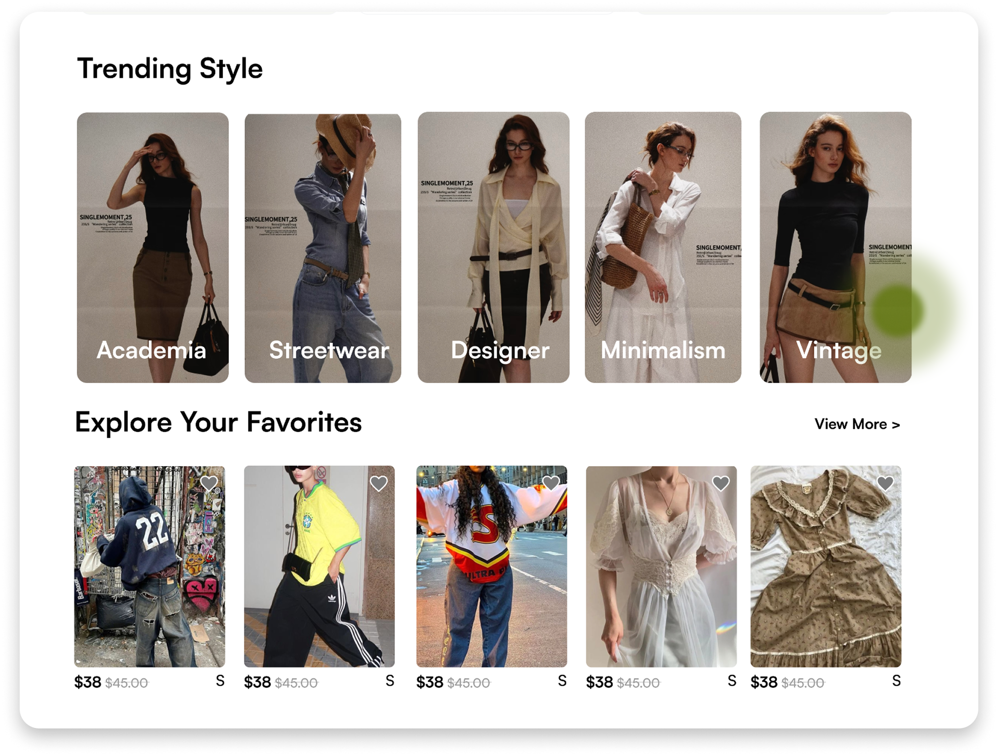
“There are a lot of aesthetics here— let me pick one first so I’m not endlessly scrolling.”
1
“Vintage. Yep, that’s totally my vibe.”
2
“The price works and the look is exactly what I want. I’m adding it to my cart.”
4
“This dress is cute— let me tap in 
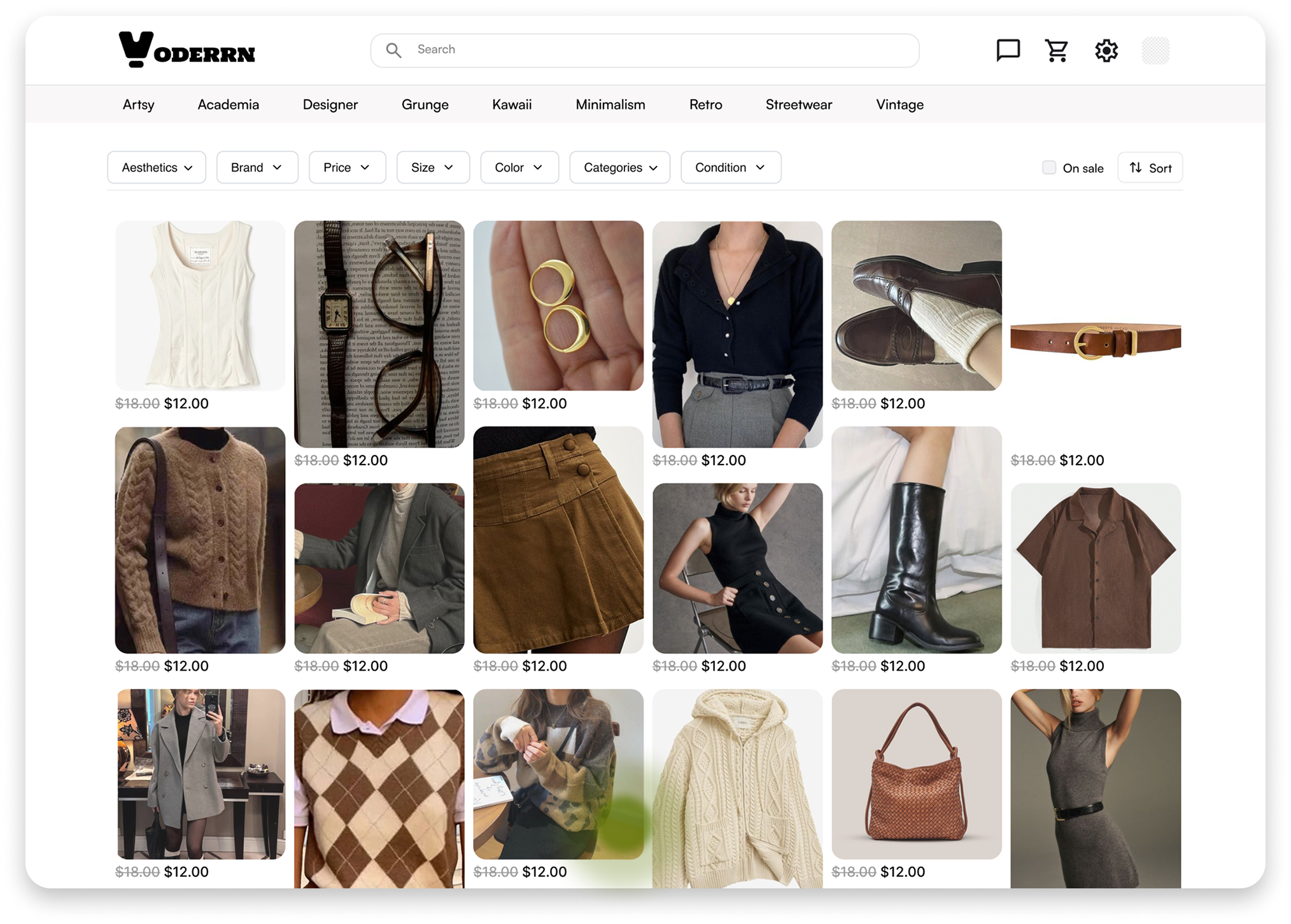
and check the photos and details.”
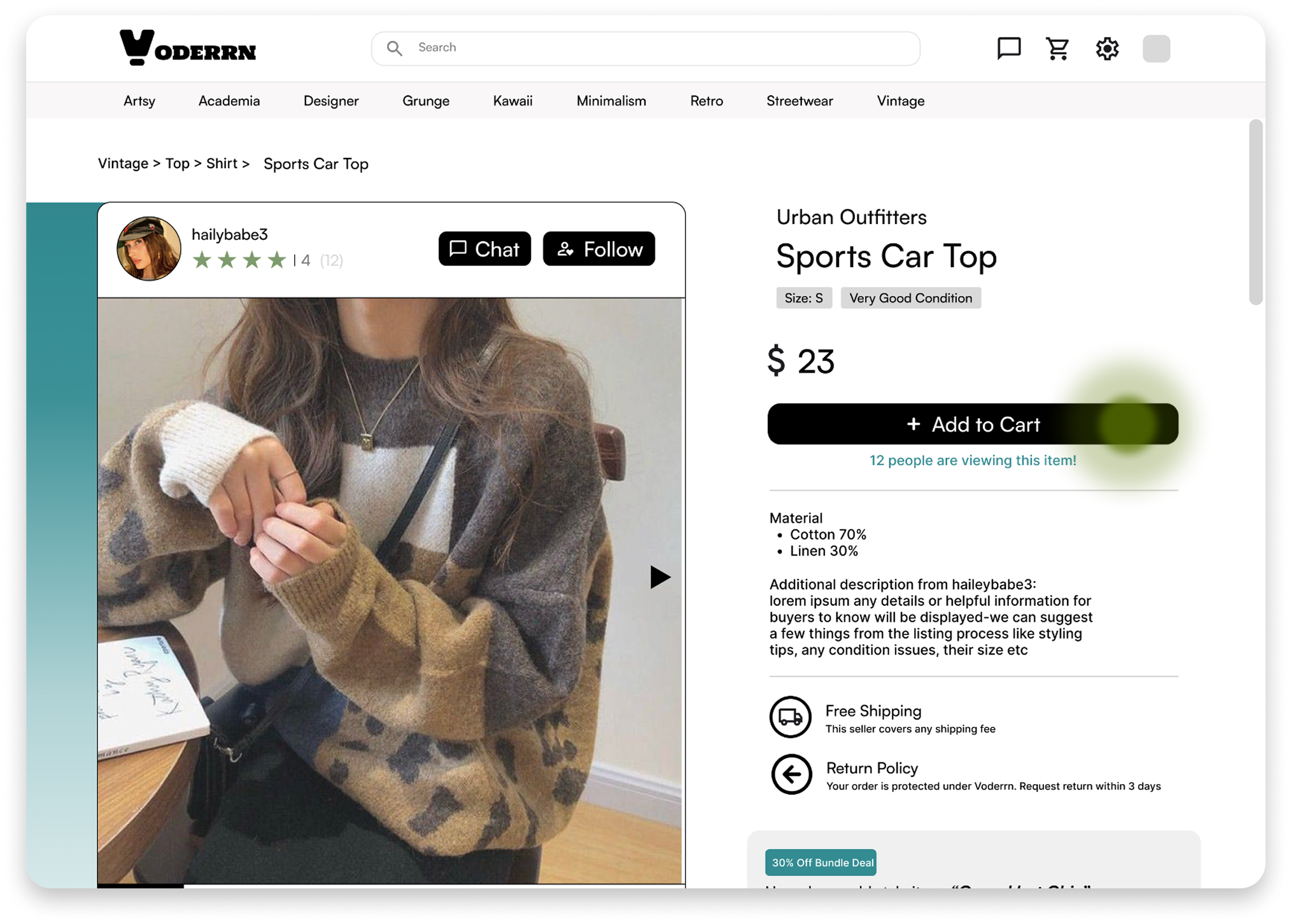
3
In this flow, Emma adds the outfit to her cart in only 4 clicks and under 1 minute👏
“Need a new style—how can I change my recommendations?”
One month later, Emma revisits Voderrn.
She’s now a repeat customer with three completed purchases.
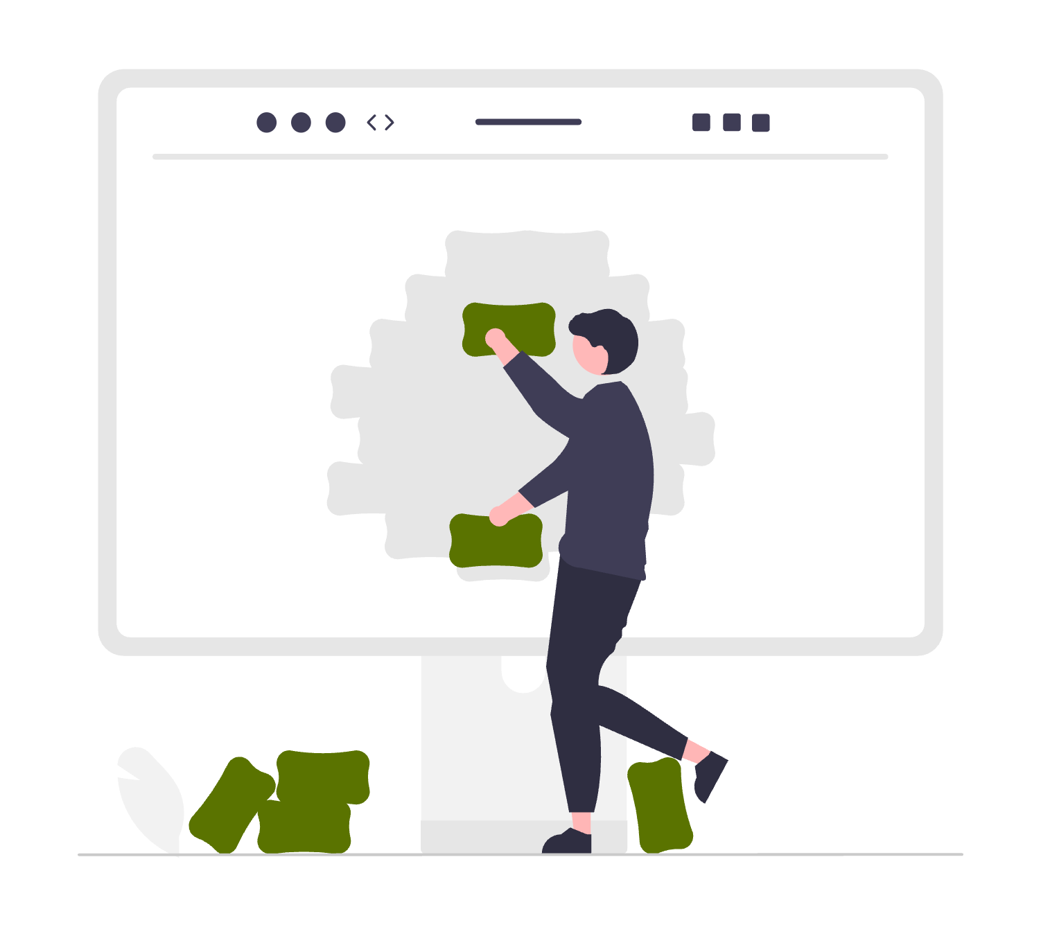
Today, she wants to explore a new style—streetwear—and refresh her wardrobe
“I’m really into Streetwear—let me update my preferences so my feed reflects that.”
1
“Aesthetics—perfect. I can adjust my style recommendations here.”
2
“Love it. The landing page is already 
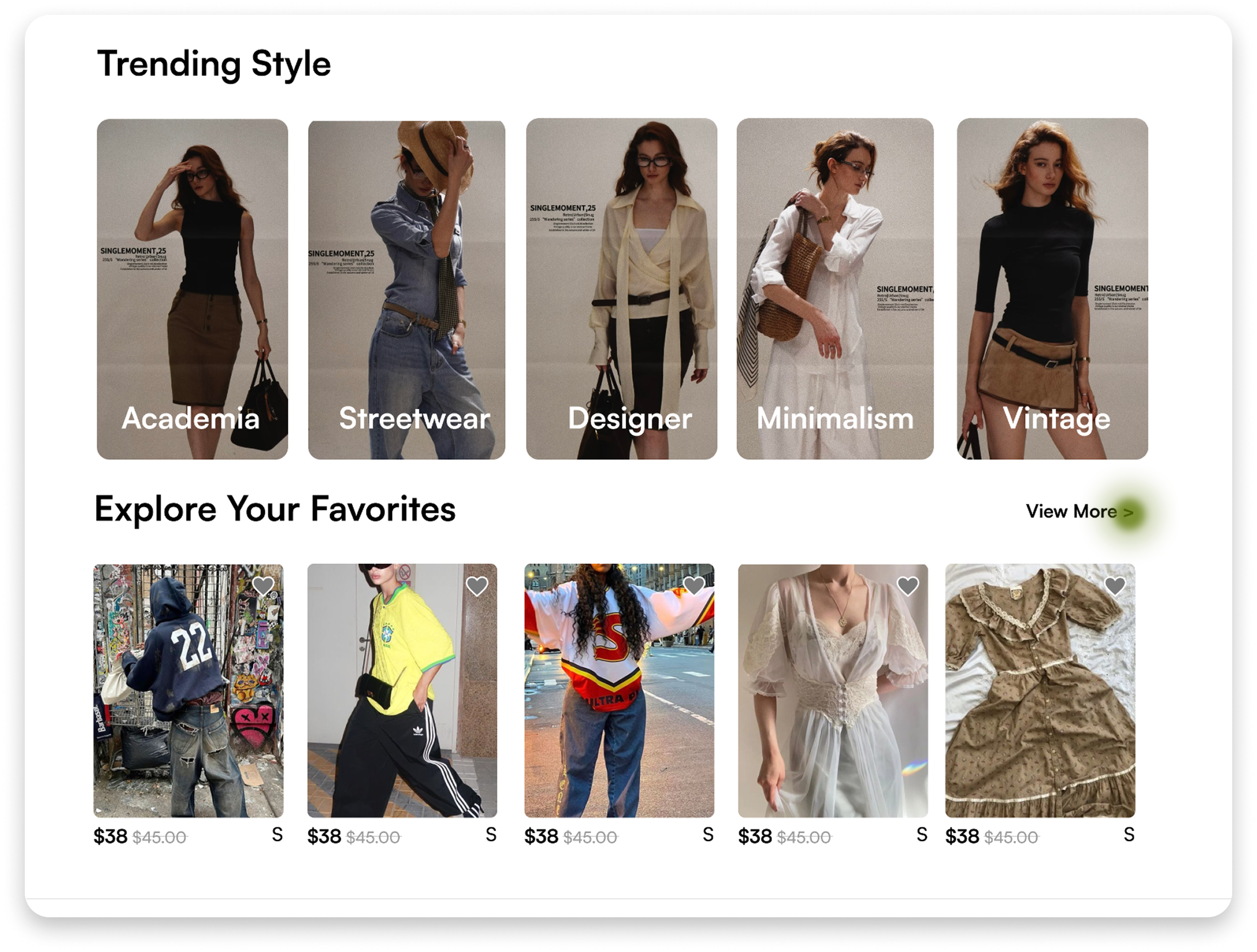
shifting toward streetwear.”
4
“Streetwear it is—done in seconds. I’m ready for a new mix.”
3
Because of the personalized aesthetic experience, Emma starts to trust Voderrn, builds it into her routine,
and gradually becomes a loyal repeat customer💪
Let’s Streamline the Flow
Second Challenge
How might we reduce user effort?
“Felt like I had to tap through a million screens just to pay. I gave up.”— Reddit
Research shows that when a flow spans around five pages, nearly
70% of users abandon it
(Baymard Institute, 2023).
I explored multiple iterations and consolidated key actions into
fewer screens, reducing scroll fatigue.
“Need to add a card—what’s the simplest way?”
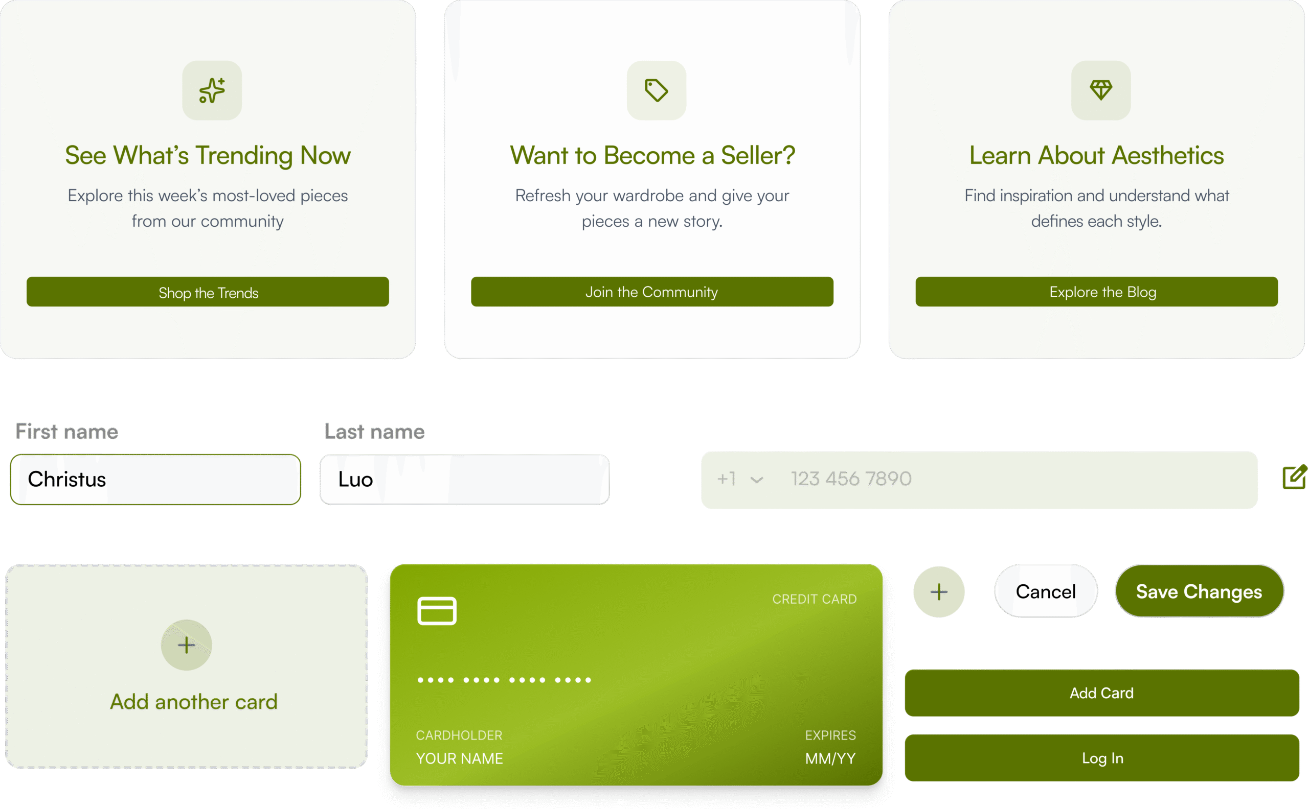
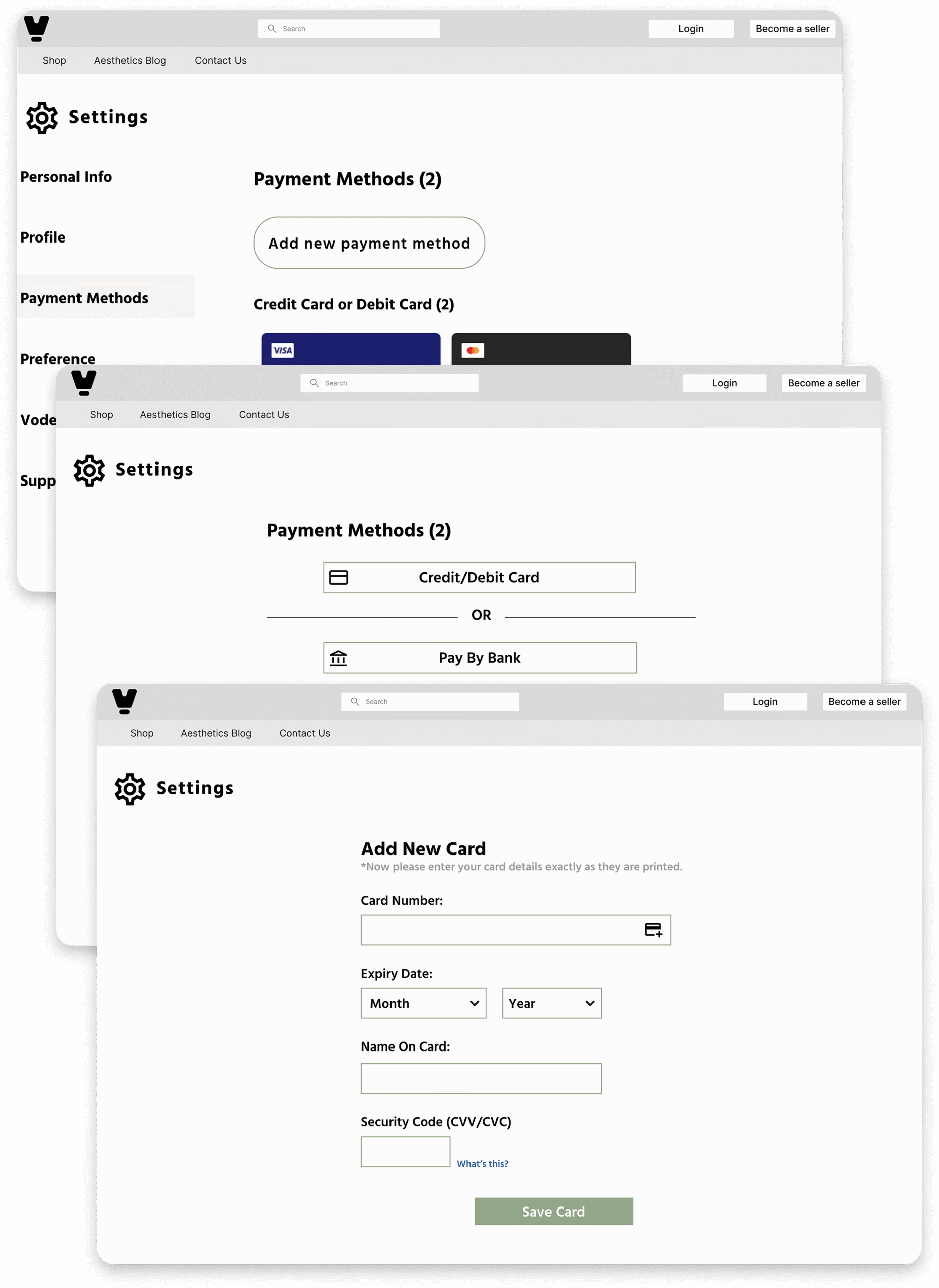
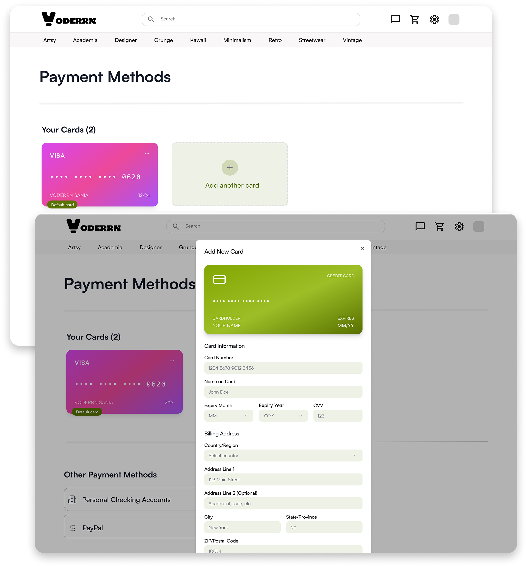
Emma wants to add a new payment method.
Compared to the old version, the latest flow reduces the process from 3 pages to 1,
making completion about 50% faster
Old Version
“I have to bounce between three pages. I’m tired.”
MVP
“I can finish it all on one screen. Way easier.”
“Need to update my profile—what’s the fastest way?”
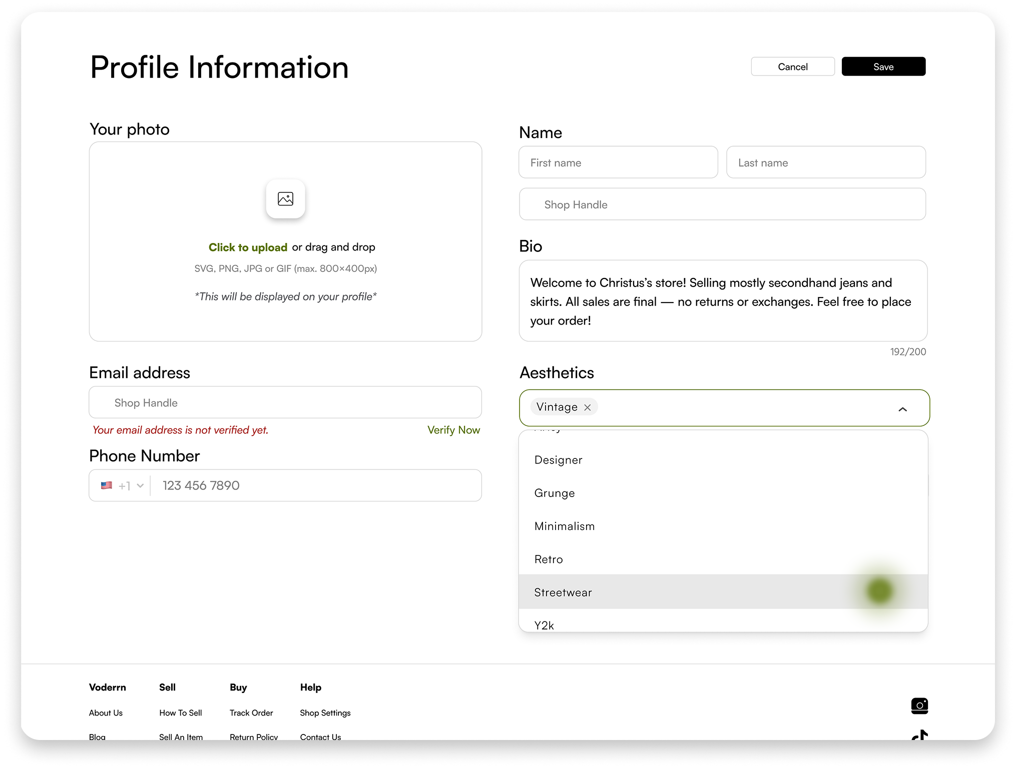
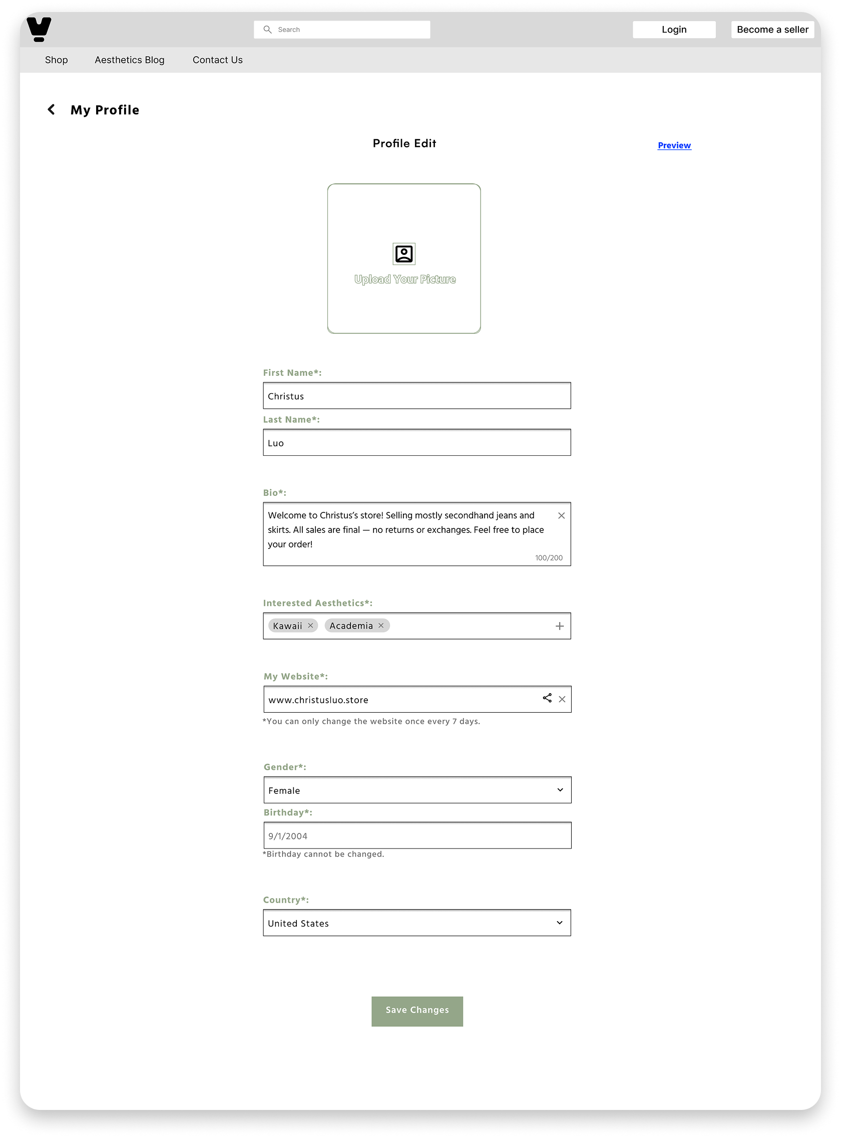
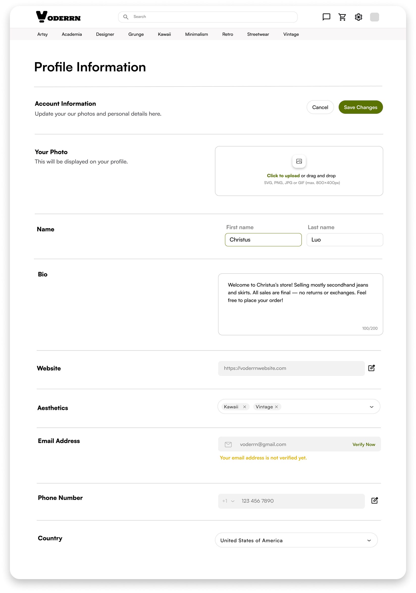
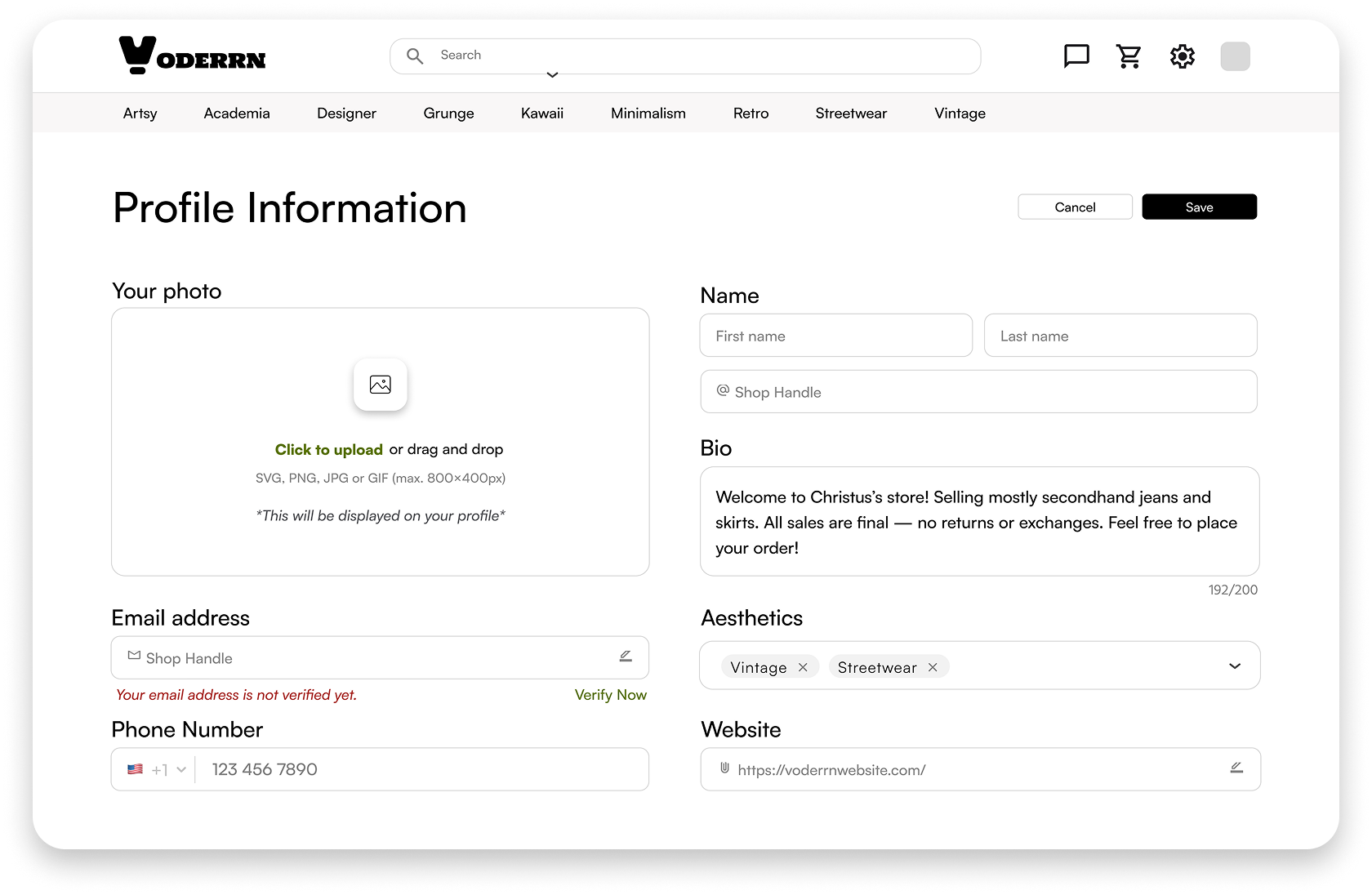
Next, she lands on the profile page to update her personal info.
Compared to the previous flow, the latest experience
cuts completion time by 33% and reduces drop-off during profile edits by 62%
Version I
“There’s too much scrolling—it’s annoying.
And the mobile-like layout feels off.”
Version II
“This feels cleaner, but I still have to scroll times to finish.
It makes me want to quit.”
MVP
“One screen, no scrolling. It’s smoother, faster, and so much easier.”
After improvements, users reported 17% higher intent to use, and showed a
81% increase in satisfaction, which strengthened overall user retention potential🚀
DesignPutsTarget UsersFirst
Third Challenge
How might we make users feel seen?
“When I’m browsing, I feel ignored—even though I’m the one paying.”— Sophie, 25
Customers shared that the browsing experience made them feel overlooked rather than valued. To sustain engagement and conversion, I prioritized the category and model options.
Category
“With the Women category larger and centered,
it’s much easier to spot—and I’m more likely to click.”
Model Option
“When I see women modeling it, I can actually picture myself wearing it, which makes me more likely to buy.”
The updated visual hierarchy increased click intent by 33% and boosted purchase intent by 28%🛒
🔧
BuildDesign System
Stay
Consistent
⚙️
From Tone to Trust
Theme Colors
Color sets the tone.
#5A7300 was chosen to convey a calm, eco-friendly feel
From Tokens to Blocks
Component Library
System sets the rules.
I streamlined 35+ UI assets and shipped 20+ components.
Design System Quote — Centered
“The design system makes Voderrn feel way more legit and trustworthy. And the green color theme really sticks in my head.”
We made it! ✨
Users clear, Effortless, Consistent.
Business Goal
Result
2,000+Global Users👥
$1,500+Transactions🛍️
$50KRevenue💰
45%Satisfaction↑😊
Design System Quote — Flipped
“I’m loving shopping on Voderrn more and more—officially a regular with 30+ items ordered this year. Thanks for the design, and I’m excited for what’s next!”
Reflection
Key Learnings
1.
Design With Purpose.
Tie every design decision to measurable business outcomes, especially across e-commerce flows .
2.
Design Systems Matter.
Establish and validate a design system early to improve consistency, enabling scalable 0→1 product growth.
3.
Strong Collaboration Wins.
Communicate with team to align on intent and trade-offs, accelerating delivery and improving quality.